Swift Tool Belt, Part 1: Adding a Border, Corner Radius, and Shadow to a UIView with Interface Builder

During my iOS work, I’ve assembled a set of code that I bring with me on every iOS project. I’m not talking about large frameworks or CocoaPods here. These are smaller Swift extensions or control overrides that are applicable to many projects. I think of them as my tool belt.
In this post, I’ll show you an extension that will add a border, a corner radius, and a shadow to any UIView, UIButton, or UILabel and allow you to preview what it will look like in Interface Builder.
 Back in 2014, I wrote a blog post on Expanding User-Defined Runtime Attributes in Xcode
where I added a border, corner radius, and shadow to a UIView using
Interface Builder’s user-defined runtime attributes. This solution had
no type checking—you had to type the property you wanted to modify by
hand and often had to look up what it was called. You also had to run
your project in order to see the effect of the runtime attribute.
Starting with Xcode 6, there is a new mechanism that solves a lot of these problems.
Back in 2014, I wrote a blog post on Expanding User-Defined Runtime Attributes in Xcode
where I added a border, corner radius, and shadow to a UIView using
Interface Builder’s user-defined runtime attributes. This solution had
no type checking—you had to type the property you wanted to modify by
hand and often had to look up what it was called. You also had to run
your project in order to see the effect of the runtime attribute.
Starting with Xcode 6, there is a new mechanism that solves a lot of these problems.IBInspectable
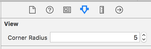
Adding an@IBInspectable attribute to a property in your
class will expose that property to the Attributes Inspector tab of
Xcode. Now you have a convenient way of modifying that property without
having to type it manually in the user-defined runtime attributes
section. This solves the problem of having to remember the name and type
of the property that you want to modify. Let’s see what that looks like for setting a cornerRadius of a UIView.
Swift
extension UIView {
    @IBInspectable
    var cornerRadius: CGFloat {
        get {
            return layer.cornerRadius
        }
        set {
            layer.cornerRadius = newValue
        }
    }
}
This inspectable attribute can be applied to other properties of UIView that are missing from Interface Builder.
Let’s add a borderColor property. Since the
@IBInspectable
attribute builds upon the mechanism for user-defined runtime
attributes, we are still limited to the types that can be set by Xcode’s
Interface Builder. We have to perform some trickery if the types do not
line up exactly with the property we want to set. For instance, a view’s borderColor is of type
CGColor, but Xcode can only set a color using the type UIColor. A simple conversion on the getter and setter will solve the problem.
Swift
@IBInspectable
var borderColor: UIColor? {
    get {
        if let color = layer.borderColor {
            return UIColor(cgColor: color)
        }
        return nil
    }
    set {
        if let color = newValue {
            layer.borderColor = color.cgColor
        } else {
            layer.borderColor = nil
        }
    }
}
Swift
extension UIView {

    @IBInspectable
    var cornerRadius: CGFloat {
        get {
            return layer.cornerRadius
        }
        set {
            layer.cornerRadius = newValue
        }
    }

    @IBInspectable
    var borderWidth: CGFloat {
        get {
            return layer.borderWidth
        }
        set {
            layer.borderWidth = newValue
        }
    }

    @IBInspectable
    var borderColor: UIColor? {
        get {
            if let color = layer.borderColor {
                return UIColor(cgColor: color)
            }
            return nil
        }
        set {
            if let color = newValue {
                layer.borderColor = color.cgColor
            } else {
                layer.borderColor = nil
            }
        }
    }

    @IBInspectable
    var shadowRadius: CGFloat {
        get {
            return layer.shadowRadius
        }
        set {
            layer.shadowRadius = newValue
        }
    }

    @IBInspectable
    var shadowOpacity: Float {
        get {
            return layer.shadowOpacity
        }
        set {
            layer.shadowOpacity = newValue
        }
    }

    @IBInspectable
    var shadowOffset: CGSize {
        get {
            return layer.shadowOffset
        }
        set {
            layer.shadowOffset = newValue
        }
    }

    @IBInspectable
    var shadowColor: UIColor? {
        get {
            if let color = layer.shadowColor {
                return UIColor(cgColor: color)
            }
            return nil
        }
        set {
            if let color = newValue {
                layer.shadowColor = color.cgColor
            } else {
                layer.shadowColor = nil
            }
        }
    }
}
IBDesignable
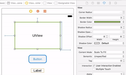
If you try to modify your@IBInspectable properties, you
will notice that Interface Builder will not show any of your changes in
real time. When you build and run your project, then your border or
shadow will show up on your control. We can fix this by using another
attribute called @IBDesignable. This attribute tells Xcode that it can render the control directly in Interface Builder. The
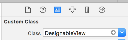
@IBDesignable attribute has to be placed on a class, not a property. Just adding it to our UIView extension will not work. That means we have to override UIView, UIButton, and UILabel and add this attribute in order to see changes in real time. Luckily, because of inheritance, we don’t have to repeat all of the
@IBInspectable properties on each custom control. The extension we wrote for UIView will also extend our custom controls. Therefore, our custom controls can be incredibly simple. In fact, they don’t need to contain any code other than the designable attribute.
Swift
import UIKit
@IBDesignable
class DesignableView: UIView {
}
@IBDesignable
class DesignableButton: UIButton {
}
@IBDesignable
class DesignableLabel: UILabel {
}
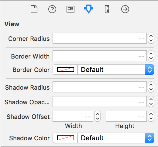
extension UIView {
@IBInspectable
var cornerRadius: CGFloat {
get {
return layer.cornerRadius
}
set {
layer.cornerRadius = newValue
}
}
@IBInspectable
var borderWidth: CGFloat {
get {
return layer.borderWidth
}
set {
layer.borderWidth = newValue
}
}
@IBInspectable
var borderColor: UIColor? {
get {
if let color = layer.borderColor {
return UIColor(cgColor: color)
}
return nil
}
set {
if let color = newValue {
layer.borderColor = color.cgColor
} else {
layer.borderColor = nil
}
}
}
@IBInspectable
var shadowRadius: CGFloat {
get {
return layer.shadowRadius
}
set {
layer.shadowRadius = newValue
}
}
@IBInspectable
var shadowOpacity: Float {
get {
return layer.shadowOpacity
}
set {
layer.shadowOpacity = newValue
}
}
@IBInspectable
var shadowOffset: CGSize {
get {
return layer.shadowOffset
}
set {
layer.shadowOffset = newValue
}
}
@IBInspectable
var shadowColor: UIColor? {
get {
if let color = layer.shadowColor {
return UIColor(cgColor: color)
}
return nil
}
set {
if let color = newValue {
layer.shadowColor = color.cgColor
} else {
layer.shadowColor = nil
}
}
}
}
Now we can see changes take effect immediately in Interface Builder.
Comments
Post a Comment